Sculpting Belgium
September 2017
News

The architecture of the void space
Buildings are matter. The space inside and around matter is void space. It is in void space that life unfolds: activity, behaviour, emotions and interactions. Considering the architecture of void space means realising that the value of architecture is directly related to the value of the void space it reveals and the conditions for wellbeing that it creates there.
This concept of an architecture of void space takes on its full meaning in an exhibition setting: if the architecture needs to fade into the background in order to focus on the works, it must also act as a guide, structuring the space, accompanying the gaze, putting reality into perspective and sublimating it.

Designing the setting for this ambitious exhibition raised two fundamental questions from the outset: how to prevent such a large number of very different works from creating a cacophonic impression that would make the exhibition’s museographic aims difficult to comprehend, and how to ensure that the design would not detract from the perception of the exceptional space that serves as its showcase?
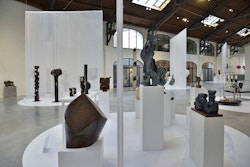
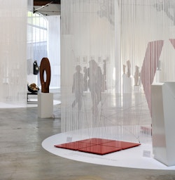
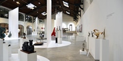
In response, we have come up with a sober, modular scheme that is also suited to the scale of the space: a floor scattered with white circles, and large curtains suspended from the beams in the roof.
The white circles are also islands that accommodate small and medium sculptures in groups of four to eight. They reveal the ‘conceptual families’ that emerge as the exhibition tells its story, from figurative art to its deconstruction through to pure abstraction. This is a way to structure thought and to accompany the transmission of knowledge – since the exhibition also has to do with art history.
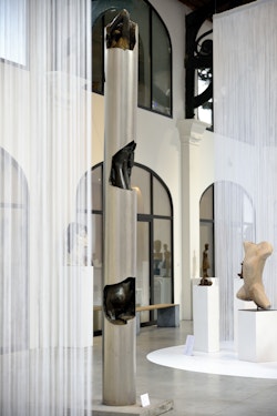
As for the large, white curtains; they are used to structure the space. Their semi-transparency creates a foreground where the sculptures are exhibited whilst also hinting at a background where other works can be discerned. They guide the visitor through the exhibition, arousing curiosity followed by a sense of discovery. The idea of the curtain as a barrier which can be physically crossed also evokes light clothing that hints at the shape of the body, one of the main themes of the exhibition.

The staggered arrangement enriches this process by emphasising the pronounced angularity of the Patinoire Royale all the better whilst combining it with unusual perspectives as visitors wander along a route intended to be fluid and sensual.
The largest works break with this pattern, as their size enables them to resonate with the majesty of the space.
Concepts of form (the circle), material (vinyl on the floor and nylon for the curtains) and colour (white) are also intended as references to the aesthetics of the 1960s.
Last but not least, the modularity of the setting is essential: the design needed to be able to change up to the very last minute, with the possibility of rearranging it halfway through. The space also had to be available for individual events during the exhibition.
Art & Build is proud to have been able to contribute to the design of this setting, both because of the content of the exhibition it supports and because of what it says about the close link between art and architecture, the very foundations of the firm founded almost thirty years ago just a few hundred metres away.
